7 min to read
Human Mortality?!
Dynamic analyses of mortality

Switzerland is renowned for its high standard of living, excellent healthcare system, and robust social safety net. Life expectancy in Switzerland has consistently been on the higher end, and the country boasts a low infant mortality rate. The Swiss healthcare system is celebrated for its quality and accessibility. In this post, I will examine how Switzerland’s human mortality has evolved over time and highlight key findings.
Before we start
I utilized data from the Human Mortality Database, available at www.mortality.org. Additionally, some R packages are necessary to create and display dynamic moving graphs.
lapply(c('tidyverse','ggplot2','gganimate','gifski','directlabels','png','transformr','gganimate'), require, character.only = TRUE)
Furthermore, we should load the ‘Switzerland data,’ with ‘America data’ serving as the comparative index.
life_table<- read.table('~/Desktop/swiss_mltper.txt',
               header = FALSE,col.names = c('Year','Age','mx' ,'qx','ax','lx','dx','Lx','Tx','ex')
               ,stringsAsFactors=FALSE)
life_table_US<- read.table('~/Desktop/US_mltper.txt',
               header = FALSE,col.names = c('Year','Age','mx' ,'qx','ax','lx','dx','Lx','Tx','ex')
               ,stringsAsFactors=FALSE)
Now, this data is in character format, so it need to be converted into numerical data and remove any NA values for data analysis and ease of access.
life_table<-life_table[-1,]
life_table<- as.data.frame(apply(life_table, 2, as.numeric))
life_table<-na.omit(life_table)

life_table_US<-life_table_US[-1,]
life_table_US<- as.data.frame(apply(life_table_US, 2, as.numeric))
life_table_US<-na.omit(life_table_US)
What is force of mortality?
$μ_{x,t}$, the force of mortality, is a concept used in actuarial science and demography. It represents the rate at which members of a given population who are currently at age x will die before reaching age (x + 1) within a specific time interval t. In other words, it quantifies the risk of death for individuals at a particular age x during the time period t.
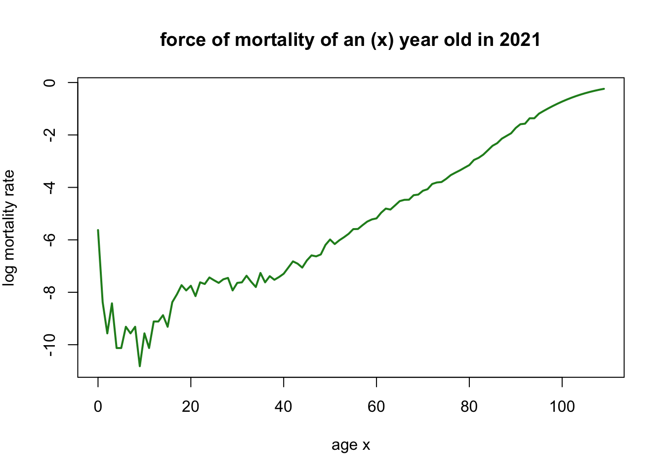
Below graph, mortality rate of age in 2021 can be found.
with(subset(life_table,life_table$Year == 2021),
     plot(Age,log(mx),
          main='force of mortality of an (x) year old in 2021',
          xlab='age x',
          ylab=expression(paste('log mortality rate')),
          type='l',col="forestgreen",lwd=2))
subset_data <- subset(life_table, life_table$Year == 2021)
subset_data_US <- subset(life_table_US, life_table_US$Year == 2021)

plot(subset_data_US$Age, log(subset_data_US$mx),
     main = 'Force of Mortality of an (x) Year Old in 2021',
     xlab = 'Age (x)',
     ylab = expression(paste('log Mortality Rate')),
     type = 'l', col = "deepskyblue2", lwd = 2,
     ylim=c(-12,0))
lines(subset_data$Age, log(subset_data$mx), col = "forestgreen", lwd = 2)
legend("bottomright", legend = c("US", "Switzerland"), col = c("deepskyblue2", "forestgreen"), lwd = 2)
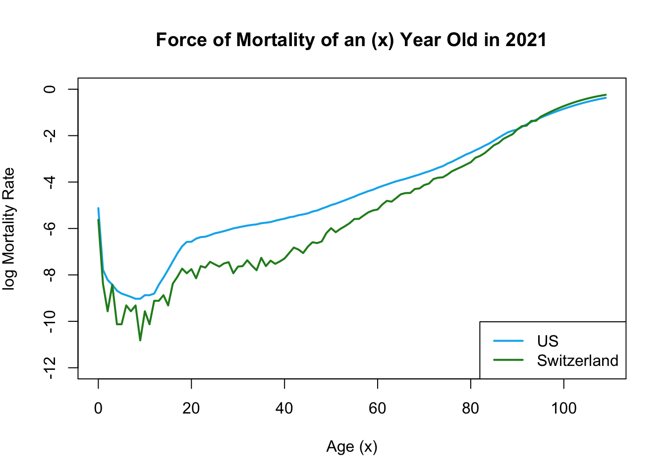
The provided graph illustrates that Switzerland generally exhibits a lower mortality rate compared to the United States.
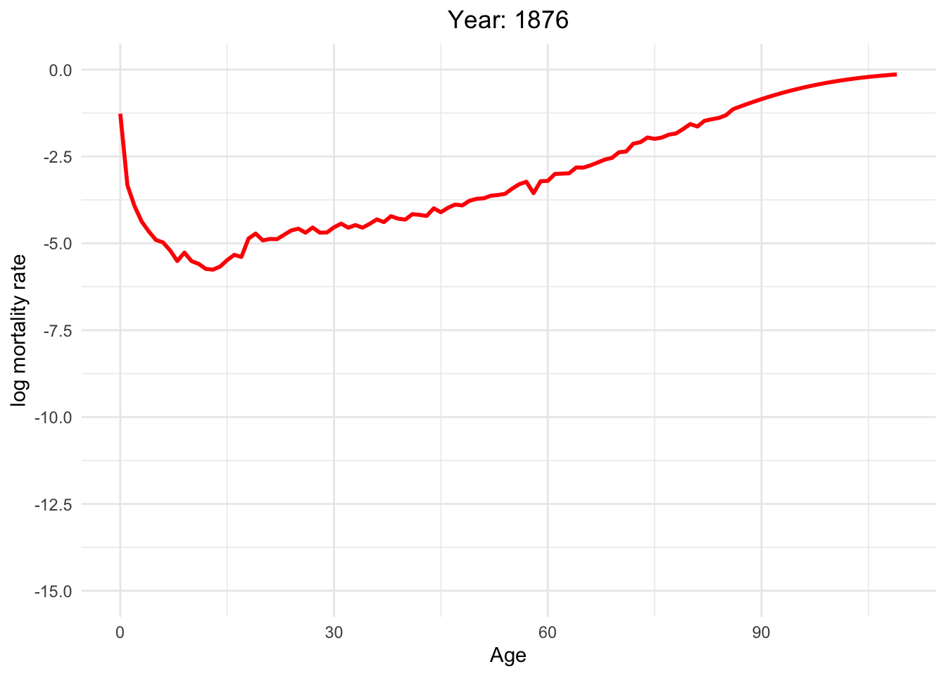
The graph below illustrates the dynamics of Switzerland from 1886 to 2021
life_table_a = life_table[life_table$mx > 0,]

Moving_Graph <- ggplot(
  life_table_a,
  aes(x = Age, y=log(mx),frame=Year,color=Year)) +
  geom_line(show.legend = FALSE, alpha = 10,size=1) +
  labs(x = "Age", y = "log mortality rate")+
  scale_y_continuous(limits = c(-15,0), breaks = seq(-15,0,2.5))+
  scale_color_gradient(low = "red", high = "blue")+
  theme_minimal()+
  theme(legend.position = "bottom") +  # Legend position
  guides(color = guide_legend(title = "Year")) +  # Legend title
  labs(title = "Year: {round(frame_time)}") +
  theme(plot.title = element_text(hjust = 0.5)  # Center title
  )

anim_plot <- Moving_Graph + transition_time(Year)

anim_plot
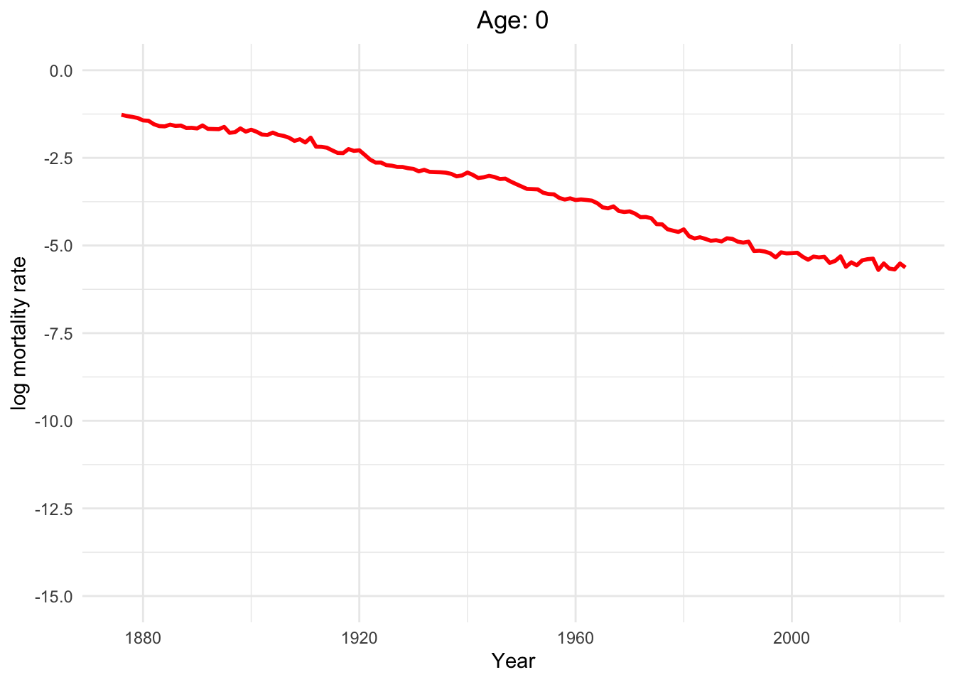
This dynamic graph presents insightful information. Firstly, it highlights a significant reduction in infant mortality and a gradual decline in mortality rates among younger generations. What are the factors contributing to this decline in mortality?
Over the decades, substantial progress has been made in medical science, healthcare infrastructure, and access to healthcare services. These advancements have translated into improved treatments, early disease detection, and overall better healthcare outcomes.
Switzerland has made remarkable effort in controlling and preventing infectious diseases. Key initiatives, such as vaccination programs, public health campaigns, and sanitation improvements, have played pivotal roles in diminishing disease-related mortality.
Additionally, it is noteworthy that one of the most crucial factors is the absence of war since Switzerland has political stability and neutrality for many decades. This peaceful environment has not only preserved human lives but has also created a conducive atmosphere for economic prosperity, healthcare development, and overall well-being.
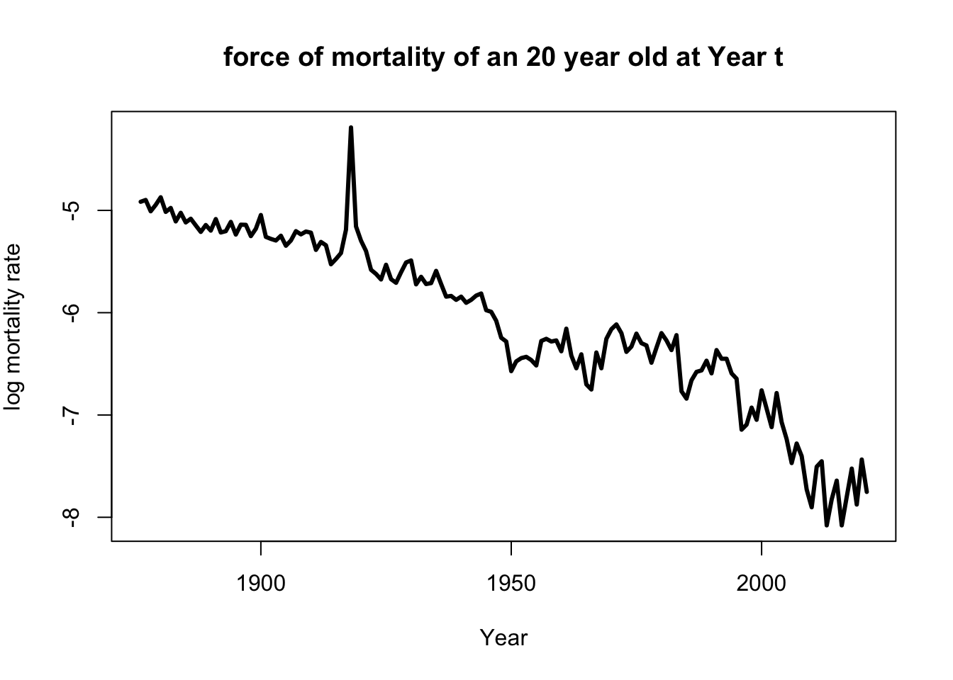
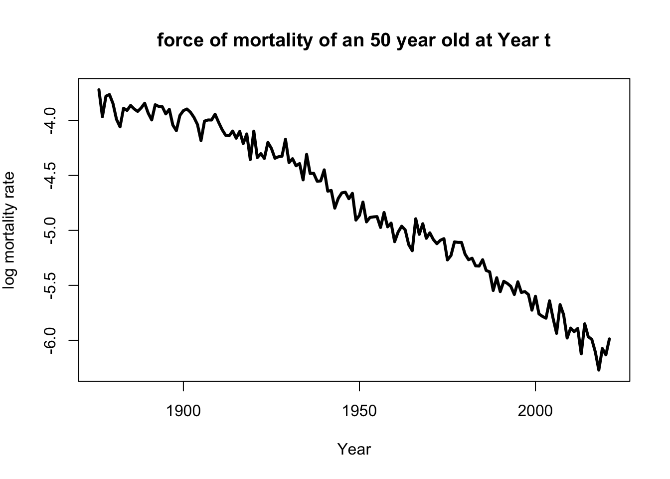
Below graph, mortality rate of Year in age 20 and 50 can be found
with(subset(life_table,life_table$Age==20),
     plot(Year,log(mx),
          main='force of mortality of an 20 year old at Year t',
          xlab='Year',
          ylab=expression(paste('log mortality rate')),
          type='l',lwd=3))
with(subset(life_table,life_table$Age==50),
     plot(Year,log(mx),
          main='force of mortality of an 50 year old at Year t',
          xlab='Year',
          ylab=expression(paste('log mortality rate')),
          type='l',lwd=3))
Dynamics of human mortality with difference ages.
life_table_b = life_table[life_table$mx > 0,]

frames <- unique(life_table_b$Age)


Moving_Graph <- ggplot(
  life_table_b,
  aes(x = Year, y=log(mx),frame=Age,color=Age)) +
  geom_line(show.legend = FALSE, alpha = 10,size=1) +
  labs(x = "Year", y = "log mortality rate")+
  scale_y_continuous(limits = c(-15,0), breaks = seq(-15,0,2.5))+
  scale_color_gradient(low = "red", high = "blue")+
  theme_minimal()+
  theme(legend.position = "bottom") +  # Legend position
  guides(color = guide_legend(title = "Age")) +  # Legend title
  labs(title = "Age: {round(frame_time)}") +
  theme(plot.title = element_text(hjust = 0.5)  # Center title
  )

anim_plot <- Moving_Graph + transition_time(Age)

anim_plot
Well, of course, as humans get older, the mortality rate increases.
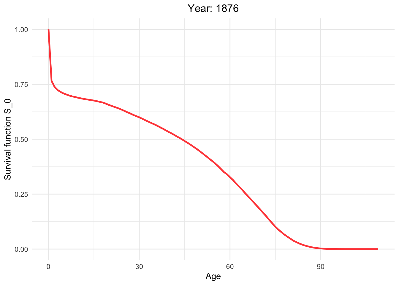
What is survival function?
The survival function, often denoted as S(t), is a fundamental concept in survival analysis, which is a branch of statistics used to analyze time-to-event data, particularly in the context of studying the survival or failure of subjects or entities over time.
Survival function from 1886 to 2021.
library(ggplot2)
library(gganimate)

# Assuming you have a life_table data frame with columns 'Age', 'lx', 'Year'

life_table_c <- life_table[life_table$mx > 0,]

Moving_Graph <- ggplot(
  life_table_c,
  aes(x = Age, y = lx/lx[1], frame = Year, color = Year)) +
  geom_line(show.legend = FALSE, alpha = 0.8, size = 1) +
  labs(x = "Age", y = "Survival function S_0") +
  scale_y_continuous(limits = c(0, 1), breaks = seq(0, 1, 0.25)) +
  scale_color_gradient(low = "red", high = "blue") +  # Color palette
  theme_minimal() +  # Background
  theme(legend.position = "bottom") +  # Legend position
  guides(color = guide_legend(title = "Year")) +  # Legend title
  labs(title = "Year: {round(frame_time)}") +
  theme(plot.title = element_text(hjust = 0.5)  # Center title
  )

anim_plot <- Moving_Graph + transition_time(Year)

anim_plot
So, how long can I live?
Whether we consider survival rates or mortality rates, it may be to vague to our real life. Fundamental question that often arises to us is, ‘So, How long can I expect to live?’ Many individuals seek answers to this query, and it remains a topic of great curiosity among us humans.
To begin, let’s explore the general life expectancy in Switzerland. Later on, I will provide an estimate of life expectancy for each country, which can give you an idea of how long you might live. However, it’s crucial to approach this information with caution.
It’s important to note that this data does not predict your personal future. Instead, it offers insights into average life expectancy based on existing statistics and historical data. Remember, Life is precious, and how we live it matters more than how long we live.
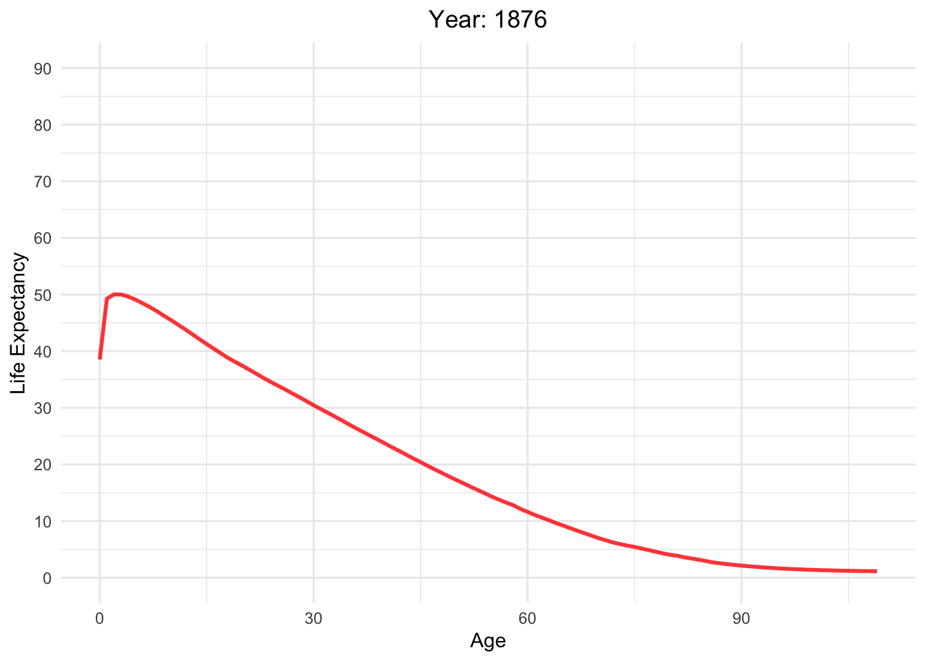
Life expectancy versus age with different Year in Switzerland
life_table_d <- life_table[life_table$mx > 0,]

Moving_Graph <- ggplot(
  life_table_d,
  aes(x = Age, y = ex, frame = Year, color = Year)) +
  geom_line(show.legend = FALSE, alpha = 0.8, size = 1) +
  labs(x = "Age", y = "Life Expectancy") +
  scale_y_continuous(limits = c(0, 90), breaks = seq(0, 90, 10)) +
  scale_color_gradient(low = "red", high = "blue") +  # Color palette
  theme_minimal() +  # Background
  theme(legend.position = "bottom") +  # Legend position
  guides(color = guide_legend(title = "Year")) +  # Legend title
  labs(title = "Year: {round(frame_time)}") +
  theme(plot.title = element_text(hjust = 0.5))  # Center title

Moving_Graph + transition_time(life_table_d$Year)
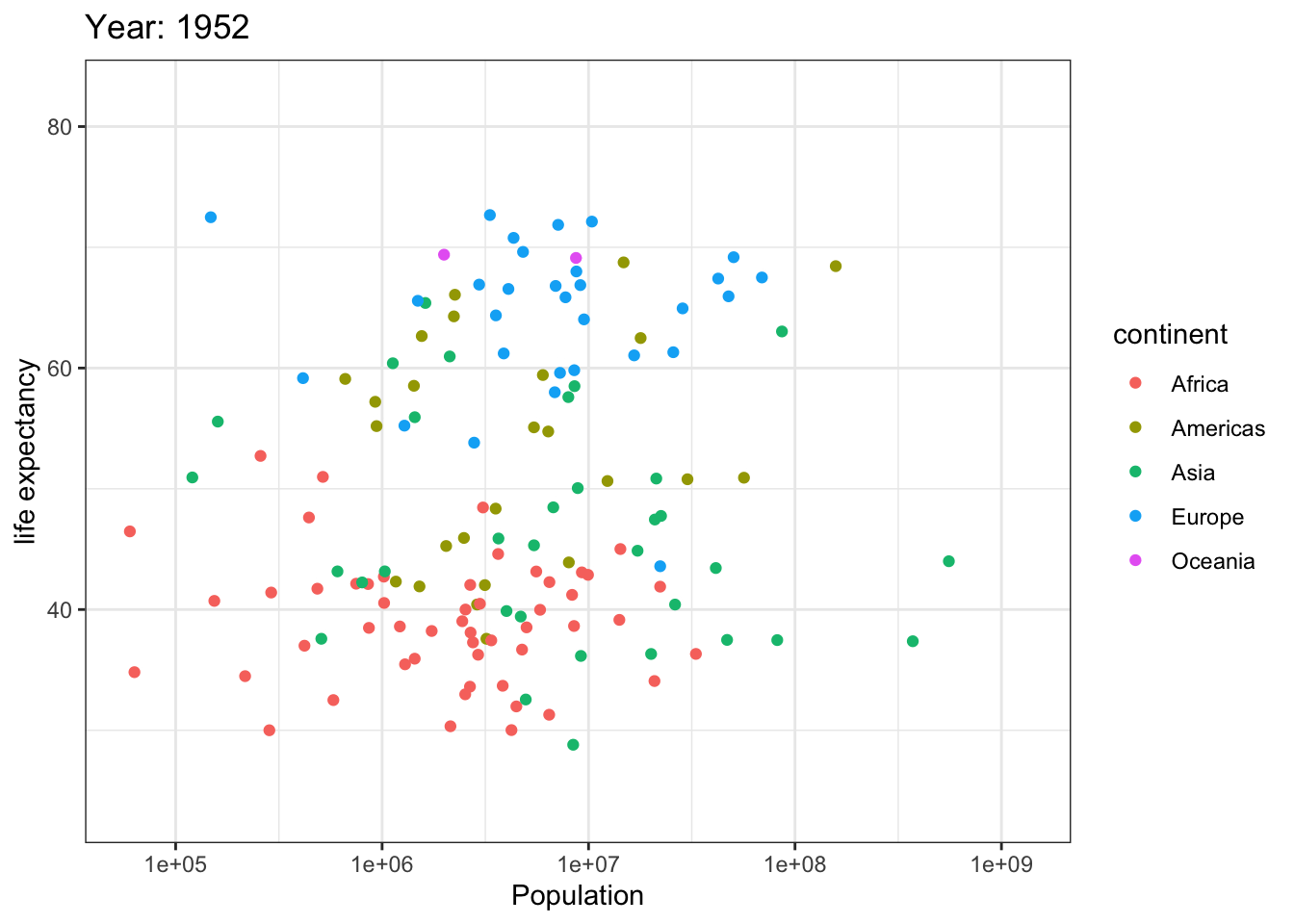
Analyzing life expectancy in relation to population trends across various years in different continent.
# Necessary libraries:
library(gapminder)
library(ggplot2)
library(gganimate)
library(dplyr)

ggplot(gapminder, aes(pop, lifeExp,color = continent)) +
  geom_point() +
  theme_bw() +
  scale_x_log10() +
  labs(title = 'Year: {frame_time}', x = 'Population', y = 'life expectancy') +
  transition_time(year) +
  ease_aes('linear')
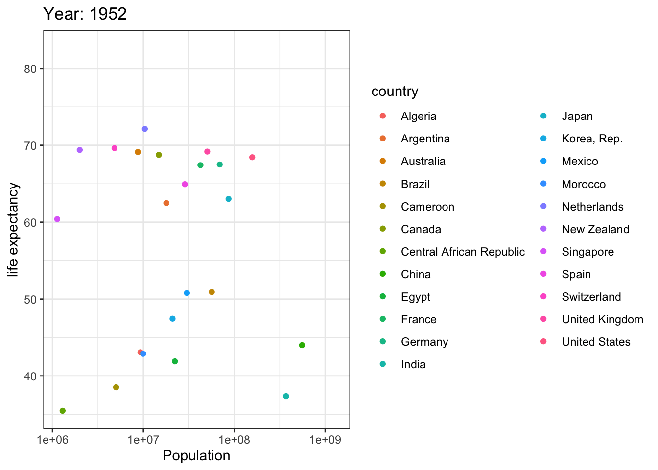
Analyzing life expectancy in relation to population trends across various years in a selection of randomly chosen countries.
# List of countries you want to select
selected_countries <- c("Algeria","Cameroon","Central African Republic","Egypt","Morocco","Argentina","Brazil","Canada","Mexico","United States","China",
"India","Japan","Korea, Rep.","Singapore","France","Germany","Netherlands","Spain","Switzerland","United Kingdom",
"Australia","New Zealand"
)

# Filter the Gapminder dataset to only include the selected countries
filtered_gapminder <- gapminder %>%
  filter(country %in% selected_countries)

ggplot(filtered_gapminder, aes(pop, lifeExp,color = country)) +
  geom_point() +
  theme_bw() +
  scale_x_log10() +
  labs(title = 'Year: {frame_time}', x = 'Population', y = 'life expectancy') +
  transition_time(year) +
  ease_aes('linear')

Comments